
Employment Development Department

✶ satisfaction rating: 9/10
EDD is a department of the California state government that administers Unemployment Insurance, Disability Insurance, and Paid Family Leave programs.
Role
UX Design Visual Design
Tools
Figma FigJam Maze
Team
4 UX Designers
Timeline
3 Weeks
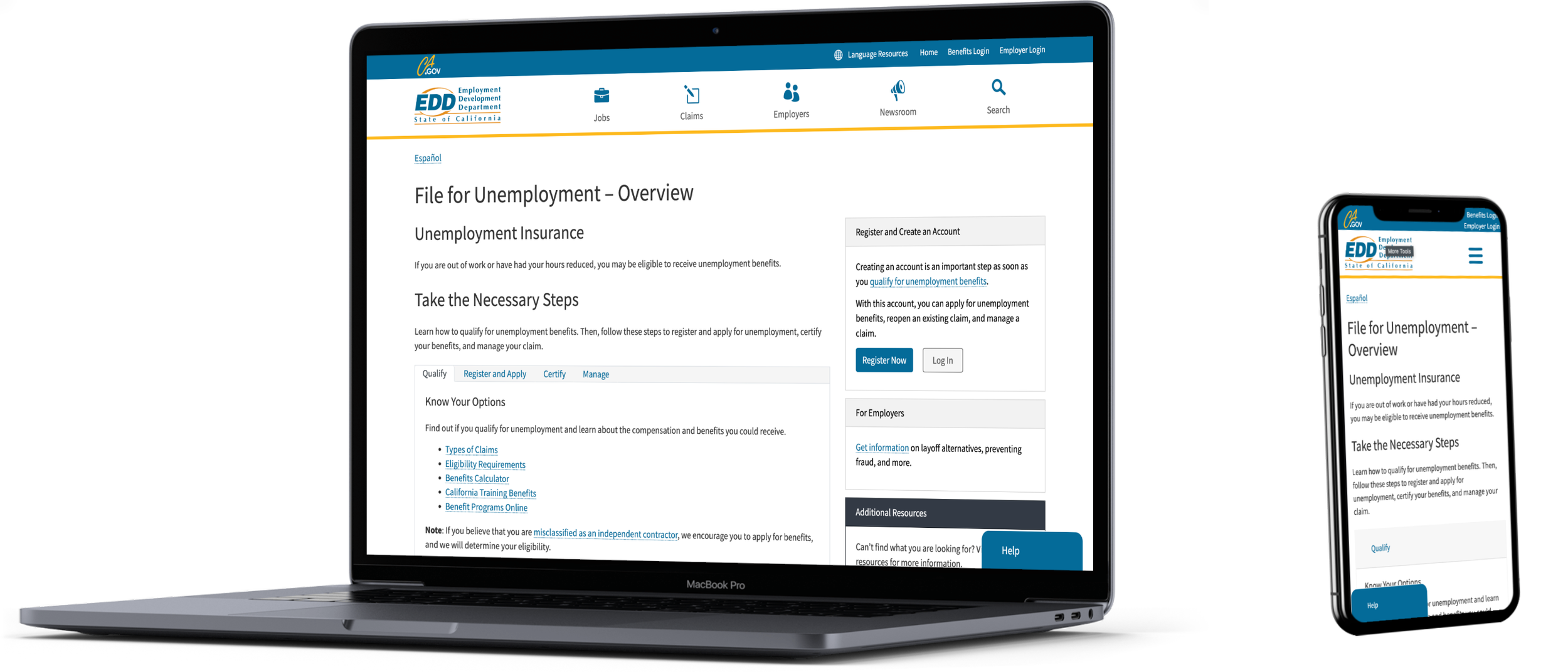
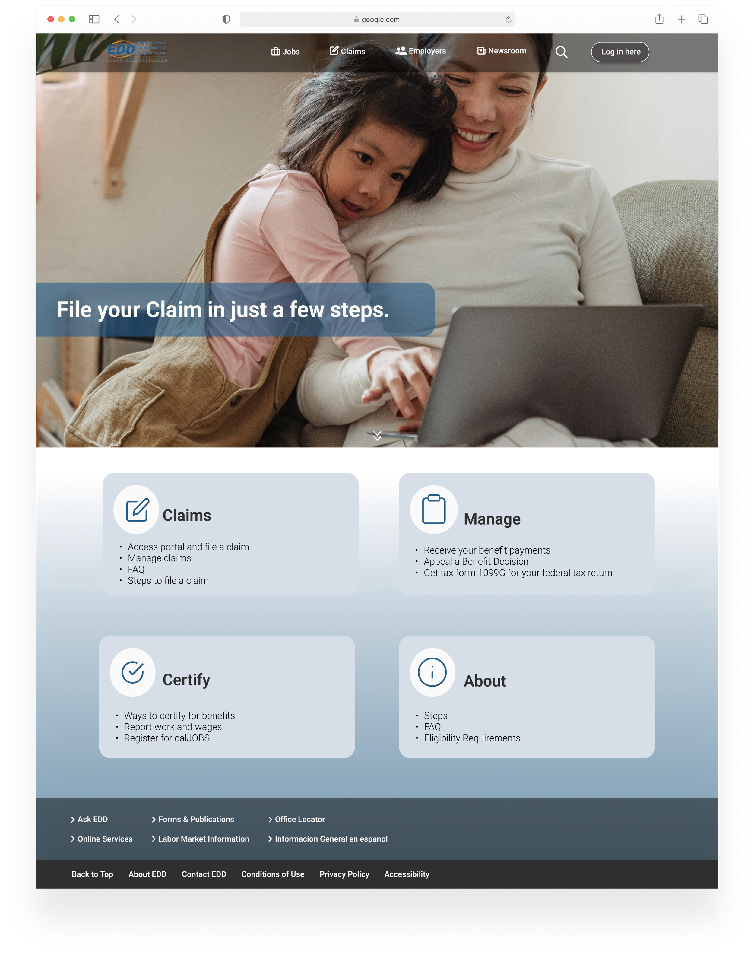
The Final Prototype
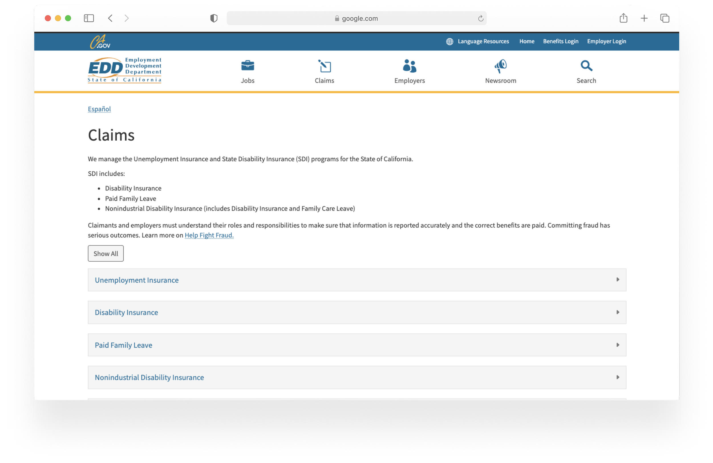
The Issue
While EDD may be helpful to those in need of income, the sites poor navigation masks important information and increases likelihood of users unable to efficiently complete the application process and in turn experience feelings of stress and frustration during a situation that is already anxiety inducing.
How might we make the process of applying for unemployment easier to reduce the stress of the user’s situation?
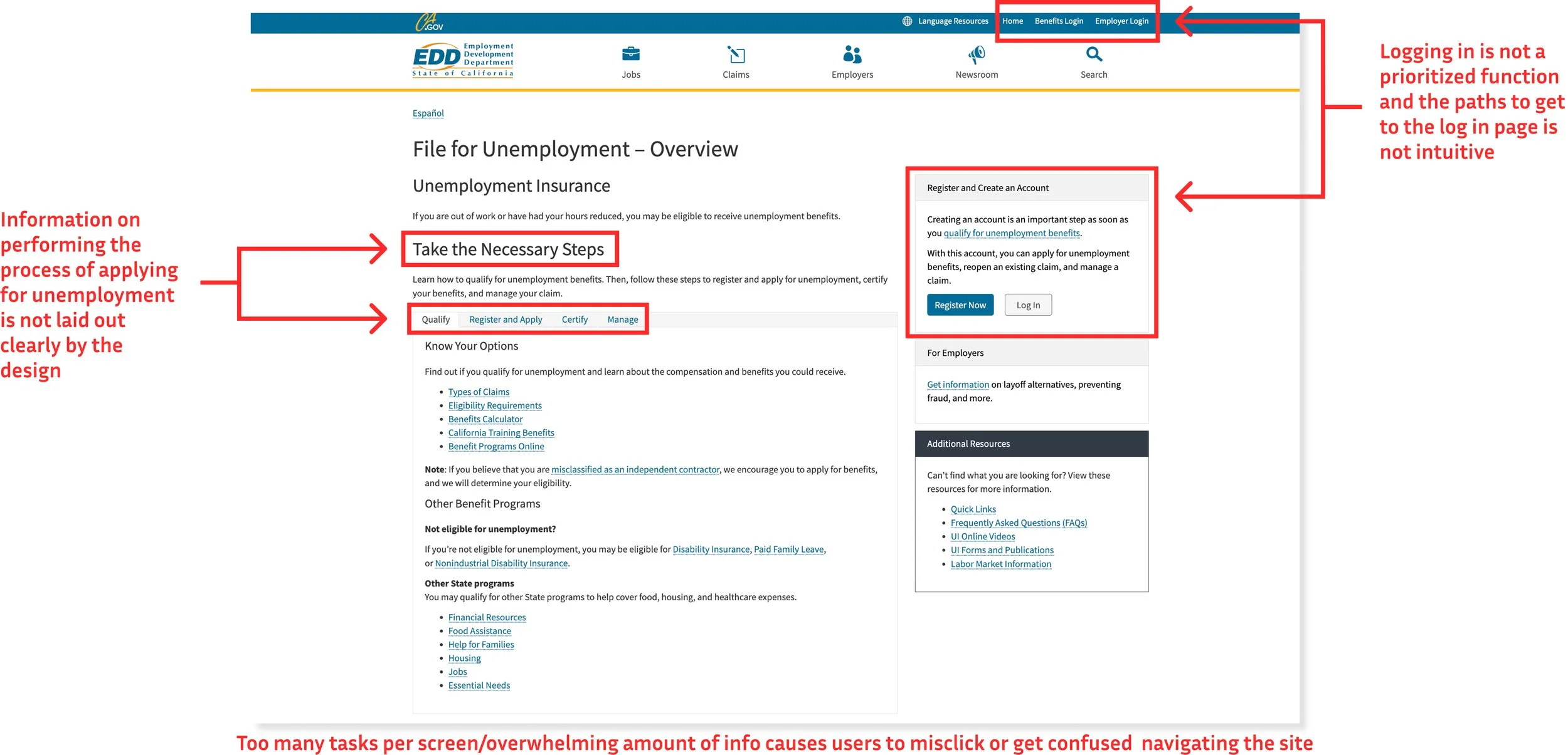
At first glance, it was evident why users found the experience frustrating. To better understand the pain points, we conducted a heuristic evaluation, which revealed that the interface failed to meet 9 out of 10 usability heuristics.
Our initial focus was on addressing the most critical issues:
Error Prevention: Reducing user mistakes through intuitive design.
User Control and Freedom: Ensuring users could easily navigate and correct actions.
Help and Documentation: Providing clear guidance to support user needs.
By prioritizing these areas, we aimed to create a more seamless and empowering experience for users.
Research: Digging In the Dirt
User Interviews: A Bump In the Road
We then conducted 5 interviews with people who have depended on unemployment to get an idea of their experience. Once all interviews were concluded, we organized our data and came to a rude awakening. While we definitely had data and pain points to empathize with our users, we did not have enough to redesign the site as well as we had wanted. This was a bit of a setback and a fatiguing situation for my team. Not wanting to waste any time, we quickly bounced back and went back to the drawing board.
User Interviews 2.0
With our new and improved script, we conducted five more interviews—and they were a success, serving up a buffet of insights. One thing became clear right away: needing unemployment benefits often comes during one of life’s most stressful moments. And unfortunately, navigating the state’s unemployment website only adds to that stress, turning an already tough situation into a frustrating experience.
If we could make this process even a little less painful, we knew we’d be making a real difference during a really hard time.
“I felt stressed out”
“I would have liked more info on steps”
“I felt the process
was time consuming”
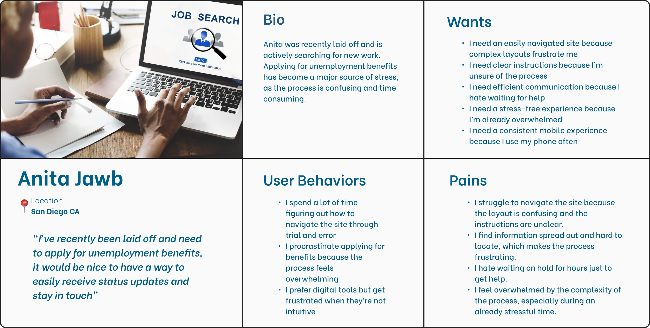
Persona: Our Guiding Light
Using our interviews to point us in the right direction, Anita, our persona, was born. Wanting to make sure they never experience an exhausting situation in their existence, we kept them in mind with each and every design decision.
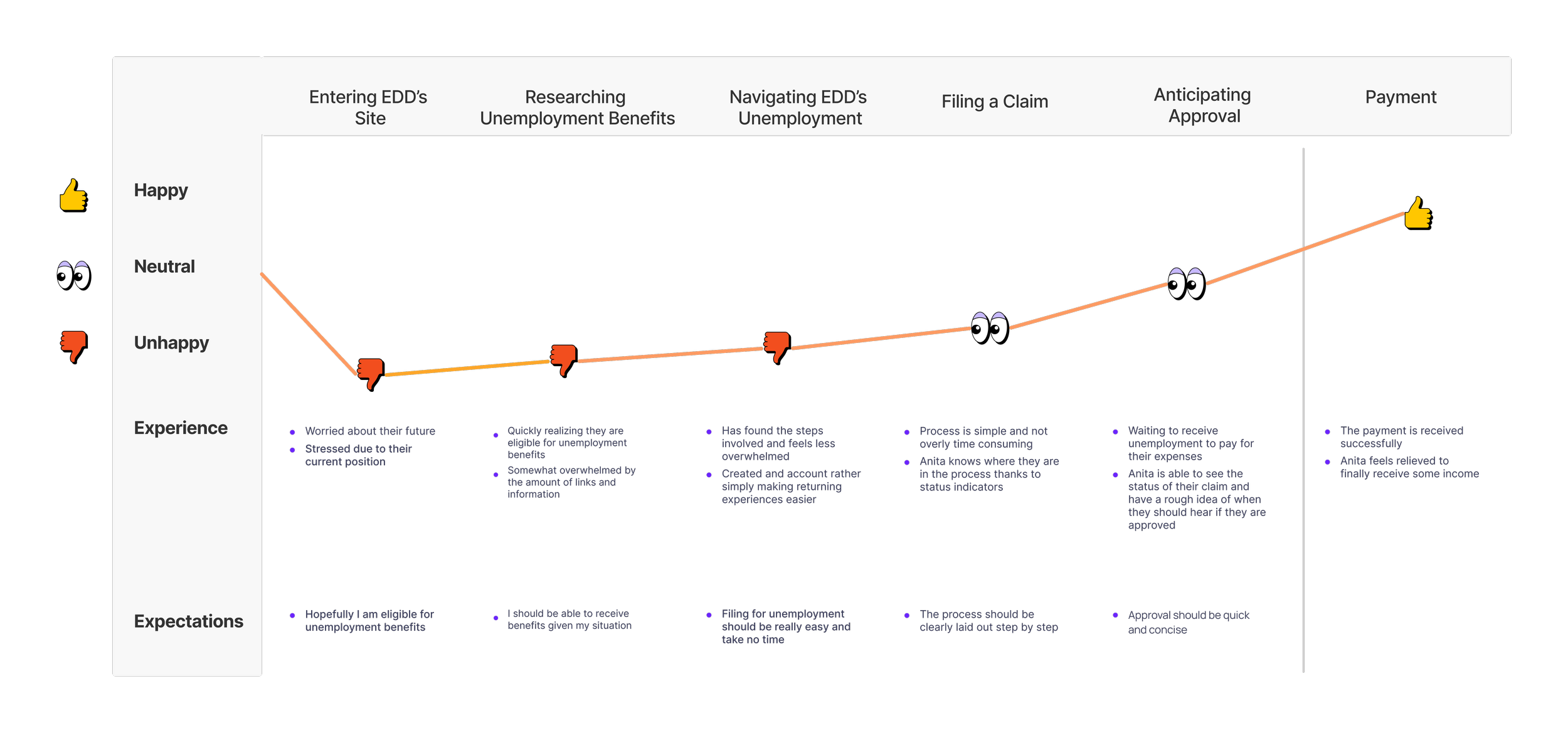
Journey Map: Anita’s Past Life
Talking to Anita, they told us all of the struggles they’ve had in their past life with the EDD’s unemployment site. Not wanting them to go through this agony again, we created their previous journey to see how we could improve it for them.
Sketches: The Blueprints
We knew that we needed to simplify all aspects of the design, making it less wordy and overwhelming for Anita. We started with some early individual sketches before coming together as a group and pulling from all of our ideas, focusing on resolving those issues that were most problematic for them.

Style Guide: Silent Communication
Because Anita is so fresh to this world, we wanted to use something simple for them to understand. We used Roboto throughout the site since it’s legible and professional, while still keeping a modern and clean look.

Wanting Anita’s eyes to feel at ease, we tweaked EDD’s original colors to create a better balance with white space. We stayed with the blue to continue emphasizing the trustworthiness of the site and the orange to try and bring some of the positivity into the design

Refining Design
Anita already experienced the stress of being unemployed and trying to file for unemployment, so it was our goal to make it as stress-free and easy for them to accomplish their tasks if they were ever put in that scenario again, God forbid.
We went for a more minimalistic design to help make the site less wordy and used a card design to add to the minimalist look and feel. To create a better visual hierarchy, we utilized colored banners with text that created contrast.
Usability Testing
Finally, it was time to test out our prototype for Anita. We conducted 5 moderated tests and gave users 3 tasks to complete for both mobile and desktop.
Mobile Results
Task 1: 4/5 indirect success
Task 2: 5/5 indirect success
Task 3: 5/5 direct success
Desktop Results
Task 1: 3/5 indirect success
Task 2: 5/5 direct success
Task 3: 5/5 direct success
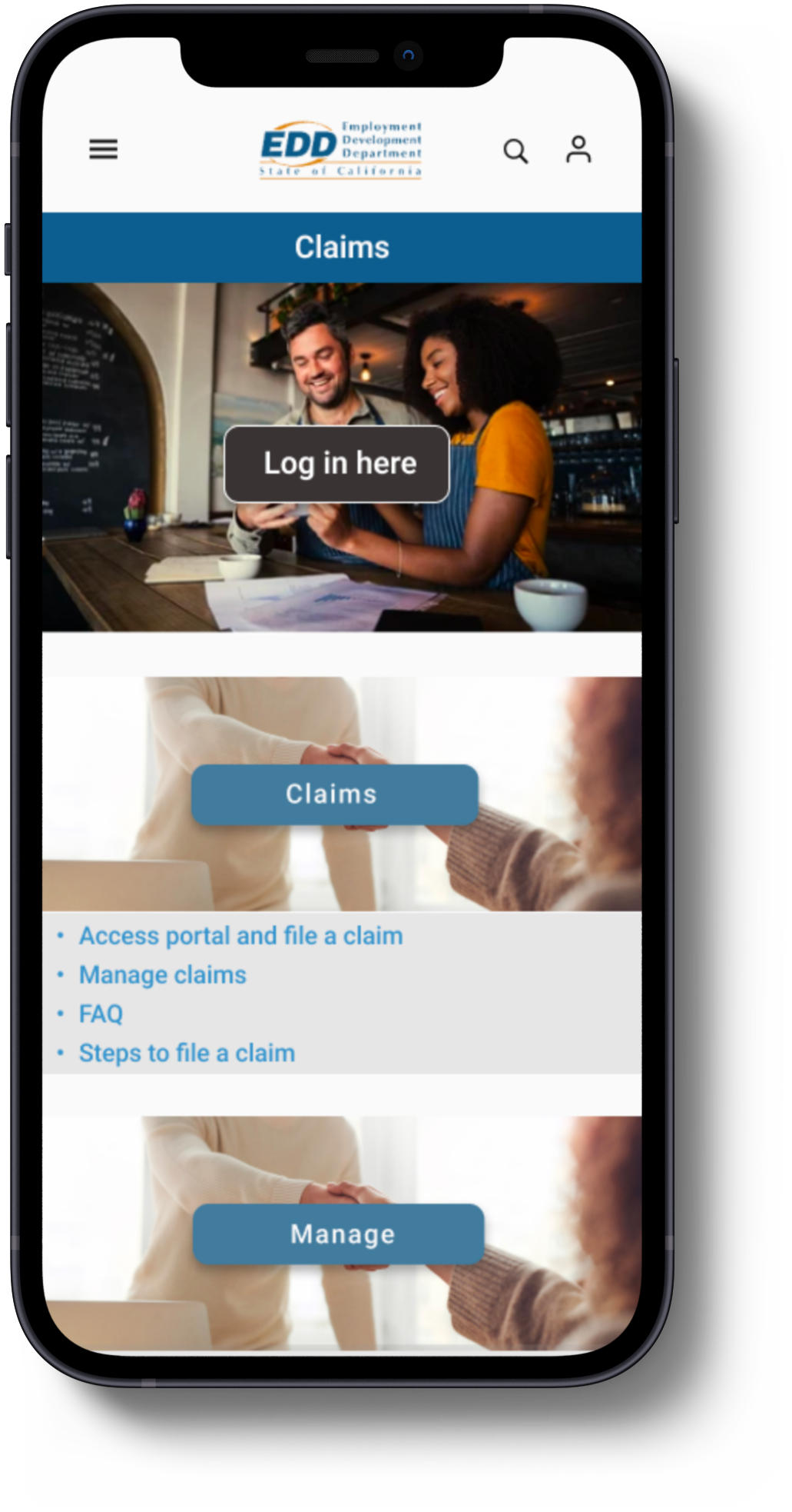
Identifying the problem
During usability testing, 3 out of 5 users expressed hesitation when navigating this screen. They found the wording on the first card confusing and were unsure if buttons were clickable. We knew we could do better for Anita and quickly implemented changes to improve clarity and usability.
Key Changes
Simplified Labels: We replaced "Register & Apply" with "Claims" to eliminate confusion and better align with user expectations.
Button Redesign: We gave buttons a solid background to make them clearly actionable and replaced "Create Account" with "Log In Here" to better match user needs.
Task Question Rewording: We noticed a task question was directing users to the wrong section. We reworded it to avoid leading users in a specific direction, ensuring it was neutral and clear.

Usability Testing: The Sequel
Round two had arrived. The suspense continued to build as we conducted our usability tests, awaiting to see if our changes were the right choice for Anita. We utilized Maze for unmoderated testing. For mobile, we had 7 testers and for desktop, we had 4.
As for the results…
drum roll please…

All users completed the tasks with direct success!!
The product received a satisfaction rating of 9/10 based on user ratings on a scale of 1 to 10.
Overall there was a vast improvement in not only efficiency, but the average time it took to complete the task. This was great news and we were excited to share with Anita how much better we’ve made the site for them.
Overall the people we tested found the prototype user friendly and intuitive. We were happy with our results, but we were ecstatic to finally accomplish our goal of creating a painless experience for Anita.
Mobile
Desktop
Next Steps: A Hypothetical Journey
If we were to continue this project, there are research approaches I would like to take to see how it affects the information we receive such as:
Conduct AB testing comparing original EDD site to redesigned site
Compare user task time of inputting dates via dropdown menu vs visual calendar using AB testing
Use card sorting to determine information architecture
Having participants take only the mobile or desktop test
As for the visual design, changes I would like to make are as follows:
Improve our information hierarchy
Relocate FAQ page on Desktop
Redesign cards on mobile claims page
Eliminate unnecessary screens
Enhance design for better accessibility
What I Learned: Reflecting On Our Success
While we may have accomplished our goal, I believe there are ways we could have increased our workflow. This taught me the importance of staying focused and completing our current task rather than alternating between many.
As a team, we also spent many hours fixing finite design issues which made me realize how crucial it is to have a set design system.
That being said, I was blessed to have such an empathetic team where everyone’s ideas were heard and considered. Having such good team reinforced my belief in active listening and effective collaboration.